- Authentic Alchemy: Insights on Resonant Branding
- Posts
- Authentic Alchemy • Episode 12: Visual Language
Authentic Alchemy • Episode 12: Visual Language
Turn your Brand Compass into color, type, and visual assets
Dustin Byerley
August 18, 2025
Happy Monday! Last week we focused on the logo, the distilled essence of your identity in one mark. Today we introduce the elements that build the rest of your visual system.
This overview outlines the assets you will define in your Brand Book (your comprehensive brand documented in book form).
Use your Brand Compass as the guide. Each choice should reflect who you are. If you want a quick refresher, review Episode 9:
https://dustinbyerley.beehiiv.com/p/authentic-alchemy-episode-9-the-consolidation-2a11c8a7a7253725
Your color palette, typefaces, and visual assets set the tone for every touchpoint. Stay close to your Compass and your identity will speak with authenticity and ease.

Begin With Color
Color is a good place to start. Our logo is a good reference when making these choices. Color forms an emotional impression before a single word.
How colors feel
Warm (reds, oranges, yellows): energy, movement, boldness
Cool (blues, greens): calm, structure, trust
Neutrals (black, white, gray, beige): balance and clarity
How to choose
Select three to five colors.
Primary: one or two lead colors
Secondary: one or two accents
Neutrals: a stable base
Contrast
Strong contrast keeps text readable.
White text on pale yellow struggles.
Navy with light gold reads clean and elegant.
Place white or black text over each color. If it reads easily, keep it.
Test in real use
Apply colors where they will live: behind your logo, on buttons, in slide headlines, and on printed swatches. Screens and print can shift tone and strength. Testing reveals what works and prevents backtracking later.

Choose Typefaces
Type sets the visual style and feeling of your brand across every piece of writing.
Note: We use the word font for simplicity. In typography, a typeface is a family of related designs, and a font is one specific weight or style within that family.
Keep it simple
Choose one font family (typeface) with a wide range of weights. Add a second family only when it clearly adds clarity or balance.
Hierarchy
Define three roles with size, weight, and spacing.
Headlines: Bold or ExtraBold for presence
Sublines: Medium or SemiBold, or a tasteful Italic
Body copy: Regular for comfortable reading
Serif vs sans serif — what they are
Serif fonts have small finishing strokes at the ends of letters, which convey heritage, editorial depth, literary warmth, and a classic tone; they suit thought leadership, craft, tradition, and long-form articles and print. Sans serif fonts use simple terminals and unadorned shapes that communicate modern clarity and a straightforward tone, making them a strong fit for digital products, startups, and services built for speed and ease.
One-family setup
Choose a typeface family with multiple weights so every role feels cohesive. For a modern sans approach, Inter or Source Sans 3 can cover headlines, sublines, and body. For a classic tone, Lora or Merriweather can carry all roles with consistency.
Two-family setup
Use contrast with purpose so one family leads and the other supports. Strong pairs include Playfair Display for headlines with Source Sans 3 for body, or Montserrat for headlines with Lora for body.
How to make pairs feel related
Pick families with similar x-height and comfortable spacing so layouts read as one system. Create contrast through role and keep styles aligned; for example, use an expressive serif for headlines and a clean sans for body to maintain clarity and balance.
Test in context
Place your choices where they will live.
Web header with headline and subline
A full paragraph on phone and on paper
One printed page read at arm’s length

What Are Visual Assets?
Visual assets carry your look into real life and build recognition through repetition. Choose only what your channels need, aligned with your Compass.
Start with only what you need
Start with your external expression. Where do people meet your brand today? Focus on the channels most people see, such as your website, social media, or your business card. Build assets for those first, then expand to other parts of your presence.
Core types and use cases
Photography
Shows your face, your work, and your world.
Use cases: About page, hero images, product or service photos, social posts, press kits
Choose: One or two headshots in natural light plus 6 to 12 context images with the same edit
Icons
Quick cues that guide the eye.
Use cases: Navigation, feature lists, steps, prompts, slide highlights
Choose: One icon family in SVG at 16 px, 24 px, and 32 px with strokes that match your style
Textures and patterns
Backgrounds or accents that add character.
Use cases: Website sections, slide headers, packaging details, social frames, print
Choose: One subtle texture or one repeatable pattern colored from your palette
Graphics and illustrations
Shapes and drawings for personality or clarity.
Use cases: Explainers, diagrams, stickers, labels, social spot graphics
Choose: Two or three recurring shapes that echo your logo and palette, or one illustration style with a single stroke approach
Apply and test in real contexts
Create each visual asset in a real use case to ensure it works in practice. Mock it up in the channels that matter most and review legibility, contrast, and scale on screen and on paper. When you can see it’s working, save the files with brief usage notes for later consolidation.
Three Examples in Action
Here are a few examples of different business expressions and simple examples of how their tone may be extrapolated into colors, fonts and visual assets.
1) Intellectual / Idea-Based
Colors: deep navy, light gray, white
Fonts: Merriweather headlines, Roboto body, Lato sublines
Assets: minimalist workspace photos, geometric line patterns, clear icon set for models and frameworks
2) Feminine / Spiritual
Colors: soft lavender, muted rose, cream, earth tones
Fonts: Playfair Display headlines, Raleway sublines, Open Sans body
Assets: natural-light portraits, organic textures, watercolor touches, hand-drawn icons
3) Action / Movement-Based
Colors: bold red or orange, black, white
Fonts: Montserrat headlines, Oswald sublines, Source Sans Pro body
Assets: motion photography, arrow or streak motifs, directional icons
Collect Everything for Later
Logo
Color palette with hex codes and notes
Type system: headline, subline, body with sizes and spacing
Visual assets: photography approach, textures or patterns, icons, graphics or illustrations
Examples of combined use: social posts, website sections, packaging, or slides
This grows into your toolkit for every future application
WEEKLY EXERCISE
Look at three well-executed brands in or near your space. Identify their color palette, type system, and supporting visual assets. Observe how these elements repeat across touchpoints and why the system works. Capture brief notes on what you see and learn.
AROUND THE STUDIO
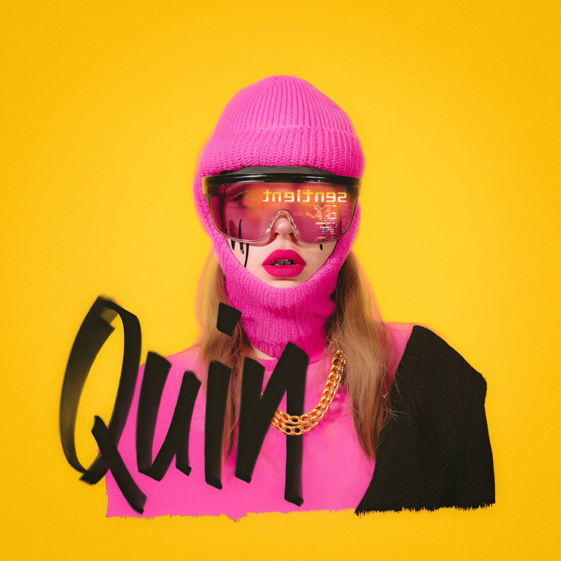
New Artist Branding : Quin - Sentient
I built a visual system around urban color and reflection. The visor mirrors the title backward, which suggests a VR world and the distance that comes with it. The mix of fashion cues, tech shine, and street energy supports the album’s commentary on how we move through the modern moment.
SHARE THE JOURNEY
If someone in your life is navigating purpose, creativity, or building something meaningful—they're welcome here. Simply copy and paste the section below and text or email it to them. Thank you!
Hey, I just started receiving a free mindful branding class in my email weekly and I thought it might inspire you. You can check it out here:

Curious about working together? Explore services, book a consult, or learn more at dustinbyerley.com.
Thank you for sharing this journey. See you next Monday!
Dustin Byerley
Explore more → dustinbyerley.com
IG: @dustin.byerley
Email: [email protected]
Authentic Alchemy Philosophy
A Framework for Becoming
Authentic Alchemy is a structured process for uncovering and expressing the core identity of any entity, whether a brand, business, leader, or individual. It emerged from the realization that the principles of brand science offer powerful tools for guiding any entity toward its highest expression.
Every entity holds innate value, though it’s often hidden by emotional patterning, inherited beliefs, and social pressures. These internal blocks can stifle genuine expression across personal, relational, and business contexts, masking the true value of your unique offering to the world. For those ready to explore meaningful self-discovery, Authentic Alchemy provides the clarity, structure, and tools necessary to uncover and clearly articulate this genuine identity.
Our core principle, Truth, realigns an entity into a state of homeostasis where it can begin to function with ease, embodying its vital character, unique perspectives, and genuine ways of being. Empathy deepens this connection by recognizing that expression is inherently relational. It attunes entities to how others experience their offer, ensuring the message is received clearly and resonates meaningfully. Together, truth and empathy create resonance, an undeniable frequency that naturally attracts alignment and connection. This resonance creates coherence, a natural alignment between identity and expression that fosters genuine magnetism.
Drawing from diverse frameworks, Authentic Alchemy also integrates tools and insights from ancient and esoteric traditions alongside proven brand science, broadening its impact into a holistic dimension. This approach marks a clear break from conventional methods that rely on superficial appeal or manipulation. When your innate value is aligned with truth and resonance, success becomes intrinsic and inevitable. Any distortion or inauthenticity disrupts this natural resonance, which is why the process must begin and remain rooted in truth.
The result? You become more than visible. You become inevitable. When you achieve this level of coherence, you naturally attract the right people, opportunities, and outcomes because you're operating from a place of effortless authority.
Authentic Alchemy connects core identity to how it is experienced in the world. It moves from self-discovery to full expression, translating essence into clear language, visuals, and presence. This is identity as signal, turning purpose into impact.